Here’s How we Use Databox to Optimize $1.5M in Paid Ad Spend Every Month
Performance + Reporting + Analysis
Editors Note: I first came ‘across’ Peter when I read about the brilliant partners program he had built up over at Hubspot. I started following his Twitter & learned about Databox, got featured on some Databox blogs, and got some excellent backlinks in the process (they do market surveys to feature folks). Over time we exchanged notes and had him correct us on a few occasions. And on the agency side, we became power users of Databox & their support team helped us explore different ways we could leverage the product internally + for our customers.
Quick favor - Before you start reading, please fill out the audience survey so we can write better essays for you (and we’d like to know who you all are) - it takes 30 secs
Illustrations by Alejandra Céspedes.
At 42 Agency, we manage a $1.5M paid ad budget across all of our clients. This is not an easy task to do well and efficiently.
In this guide, we’ll show you exactly how we do it and how Databox helps us.
Of course, demand generation encompasses a range of different marketing tactics that help build brand awareness, increase engagement, and nurture prospective leads through the sales funnel.But, all successful demand generation strategies have one thing in common: they produce sales.
To ensure that ads drive revenue, performance data is critical. Not only do we have to know what to measure, we have to make sense of all of the metrics we’re capturing on a regular basis, figure out what approaches are working and ultimately, decide what changes to prioritize so we can improve results over time.
Databox helps us do all of this efficiently with real-time dashboards, goal-tracking, alerts and more.
With with product, we essentially consolidate all of our data from separate tools into a single platform in order to:
Monitor performance metrics
Track pipeline performance across channels
Set goal projections to automatically monitor progress
Create alerts on the various goals that we set
In other words, it is a tool that allows us to do proactive monitoring across accounts to understand what we are doing right, what we need to improve, and, more importantly, what isn't working. Here is how we use Databox to monitor performance and keep the engines running on our paid ad campaigns…
Dashboards for Monitoring, Analyzing and Reporting
Dashboards allow us to pull data from multiple tools into a single view. This makes it easier for us to draw correlations between our metrics, helping us understand the ways we can improve performance across the different channels. To effectively do this, we focus on creating two different types of dashboards - Overview and Drilldown dashboards.
We use Overview Dashboards to do a quick health check of our high-level business metrics. This could be at an account level or platform level.
While the Drilldown Dashboards help us dig deeper into our data in order to understand the factors that contributed to our performance. This could be at a campaign level or even just honing into the performance of one specific metric.
1. Overall Account Performance (Overview Dashboard)
At an account level, we track impressions, clicks, click-through rate (CTR), cost-per-click (CPC), conversions, and your cost per lead (CPL). Doing so will help us understand the channels we should minimize or maximize spending in order to help us focus our efforts on the ones that yield the best results.
To provide an example, check out this dashboard we used for one of our clients:
Using these high-level metrics we can get a clear picture of the performance of our clients LinkedIn Ads account.
The comparison period in the Performance Overview table allows us to monitor the performance of our key metrics month over month. A red comparison period will indicate that we need to dig deeper into this metric at a campaign level in order to understand what might be contributing to the lower performance.
So with this dashboard, we can improve paid performance by monitoring three things:
Impressions: If we notice our impressions are dropping, we would consider changing our bid type to ensure they are competitive enough, adding ad variants for better delivery, and refreshing your audiences.
Clicks: If we notice clicks have dropped, we can review our creatives and ad copy to ensure it resonates with our audience
CPC On AdWords: If CPC is increasing, we would check the auction insights to identify the keywords that are contributing to that spike.
Why is this important?
Without a clear understanding of these metrics at an account level, it would be challenging to pinpoint the specific metric that is the root cause of lower performance. In addition, these metrics are also the leading indicators of revenue, pipeline, and efficiency on our paid media campaigns.
2. Campaign Performance (Drilldown Dashboard)
When it comes to campaign-level metrics, having access to this dashboard allows us to track which campaigns may be contributing to lower performance. Check out the example below:
By having access to this data every month, we can prioritize a couple of aspects to improve paid performance:
Top Performing Campaigns: Reviewing conversions by campaign allows us to identify the top performing and the worst performing campaigns. We can then reallocate budgets between campaigns to invest more in the campaigns that are performing better.
We can also use this dashboard to monitor the conversions of our priority campaigns. A drop in conversions will indicate that we should review our metrics to identify the causes of the significant drop (impressions/clicks/CTR/CPC) to optimize them accordingly.
Why is this important?
Without a clear understanding of these metrics at a campaign level, it would be challenging to maximize performance and accomplish our client's objectives. It helps our revenue strategist reallocate resources across channels, minimize spending, and maximize results. It is also an excellent way to help us make better data-driven decisions and build trust with our clients.
3. Overall CPA Trends and Channel Trends (Drilldown Dashboard)
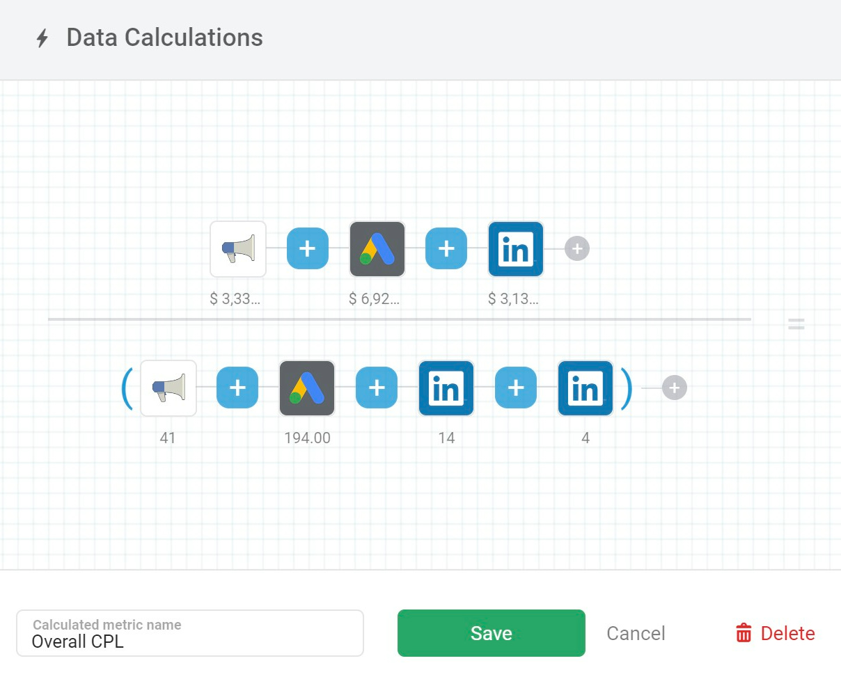
To better understand our CPL trends for BOFU/demo, we use Data Calculations to create the simple equation: (spend from all channels) / (the sum of all demo conversions across channels). This new calculated metric will allow us to make more strategic decisions.
In the following example, we are calculating the overall CPL metric across Google ads, LinkedIn ads, and Facebook ads:
Note: CPL calculation on Facebook is slightly tricky as all conversions ( leads/custom events) are tagged under “Results” in the Facebook Ads manager. Here is a walkthrough though on how to use Databox’s Query Builder to do this: https://help.Databox.com/article/445-popular-use-cases-facebook-ads-Databox#results
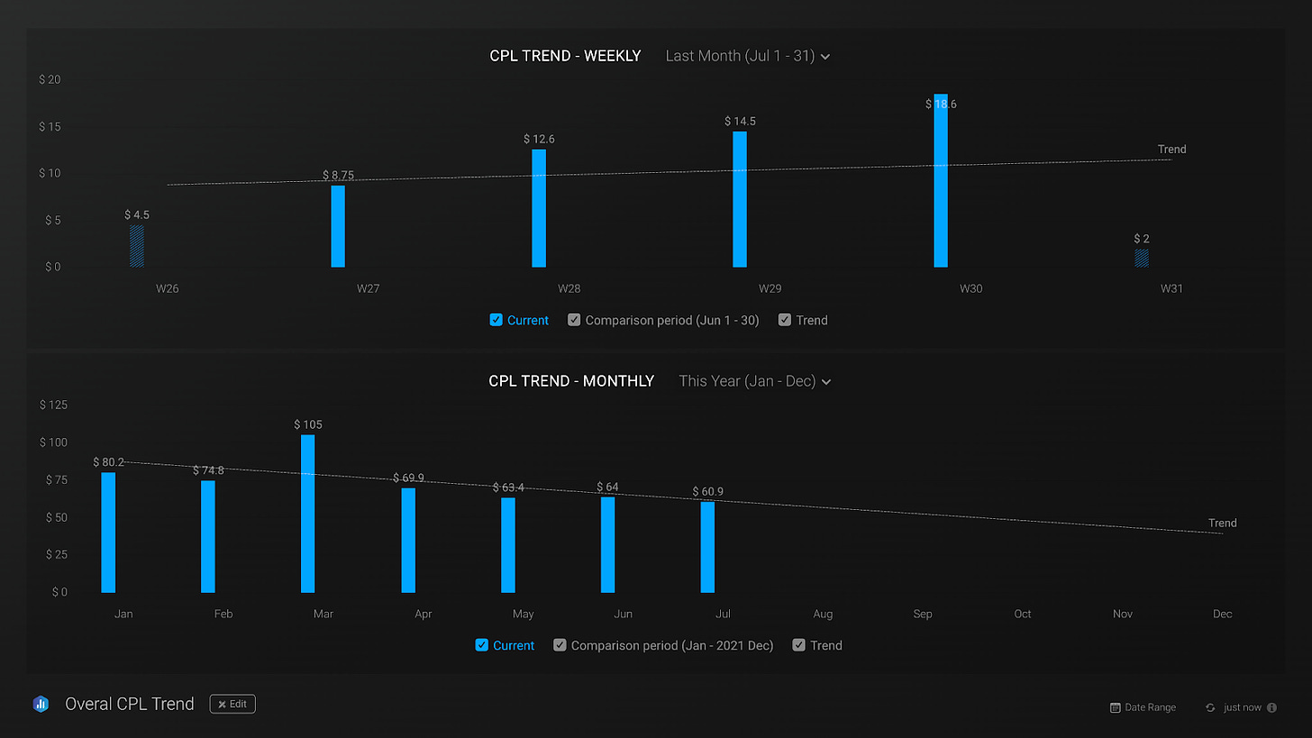
We then use these metrics to create monthly and weekly charts to monitor CPL ranges using trend lines. Here is an example below:
How do we use this monthly CPL trend dashboard for optimization?
Is the weekly CPL trend high? In this case, we would then review our campaign level or channel level dashboards to understand what is contributing to that spike. Tip: build CPL trend reports channel-wise.
Is the monthly CPL trending lower? If so, we would check the channels that show the best conversion rates and increase spending (after cross-checking opportunities/deals created by channels).
Why is this important?
Using a CPL trend dashboard allows us to gain perspective of how much we are paying per qualified lead on a monthly basis. This information will enable us to make strategic decisions and prioritize spending across channels.
4. Pipeline Performance: Opportunities, Deals, Closed Won (Overview Dashboard)
In order to create this dashboard, we needed to clearly define the metrics that would allow us to understand the pipeline and make the best decisions. So, we included a mix of metrics like deals by channels, deal amount by channels, closed-won by channels, opportunities by channels, etc.
Paid media to pipeline data monitoring is key, as a great-performing Ad that does not translate into the pipeline is not very useful. Databox helps us create a dashboard that directly connects our paid media activities to our pipeline data from a CRM like Hubspot. This means we can correlate paid media metrics with pipeline metrics like deal amount, deal count by source type, closed-won amount by source type, and more. It is definitely a helpful dashboard to further leverage paid media budgets and their impact on business growth!
How do we use this pipeline dashboard for optimization?
In the short-term, we can figure out which paid channel is creating more deals or opportunities by amount. Once we know this information, we can prioritize spending on that channel. If we have been running ads for an extended period and generated enough closed won deals - we can base decisions on this metric.
If we notice any specific campaign that is the star at driving opportunities, we can amplify the campaign and the messaging used in campaigns across platforms.
Why is this important?
With this dashboard, we can easily understand profitability by channel and medium so we can figure out what the breakeven is and what the payback period looks like for the client. We can also use this information to provide more clarity into ROAS, which enables us to directly correlate revenue contributions to marketing efforts. With this information we can build a model for pipeline and revenue growth and make more informed decisions on where to allocate our spend and resources.
Limitations
This is based on FT / LT attribution. We fully understand and acknowledge this doesn’t capture every single touch point, but we think measurement is essential.
It is important to remember that what doesn’t get measured doesn’t get improved.


5. The Time Saver Dashboard (Overview Dashboard)
Working on multiple ad management systems and looking at the data in silos can be very confusing and overcomplicates strategic decision-making. That is why we created one dashboard to have a clear perspective, make the right decisions, and save time.
The Time Saver Dashboard includes core metrics from all of our channels in one single view. The core metrics may vary depending on the client and their objectives, but the ones you see on the dashboard below are the ones we use more frequently.
Why is this important?
By having a bird’s-eye view of everything that matters on a single dashboard, we can rapidly assess what is working, what needs an update, and what does not work. Indeed this is not the only dashboard that allows us to do that, but, having an integrated dashboard that includes all the core metrics is like having the whole story to move the needle in the right direction.
6.The Ultimate Dashboard: Paid Ads to Closed Won (Overview Dashboard)
Once we are able attribute paid ads to closing customers it’s time to backtrack to campaign and ad level. Amplifying the campaigns and the messaging is the best way to accomplish the best possible results.
Why is this important?
With this dashboard we can track the amount spent in a specific channel and the direct revenue it contributes to the pipeline. By knowing which campaigns brought us the most income, we can use this information to broaden that campaign on your GTM and leverage what works over what does not perform well. Managing accounts is also complex, given the relationships and personal nature of working with clients. With this in mind, showcasing all the opportunities to the leadership team helps build trust and empower our demand strategists. Finally, this dashboard will allow us to identify pipeline leaks and fix them before raising alarms.
Dashboard Loops for a Full View & Deeper Analysis
By having access to these dashboards, our team is able to make more informed decisions to improve business performance. But, understanding business performance also means understanding the relationship between different metrics.
Creating a dashboard loop in Databox allowed us to group our dashboards together to facilitate our ability to dig into the different levels of detail in our data. Here is an example of what our Dashboard Loop looks like:
Goals and Alerts to Ensure We’re On Track Every Day
As an agency / demand marketer, monitoring spending can be daunting and it’s also not the best use of time.
With Databox we can use both goals and alerts to proactively monitor our budgets. We don’t recommend using lifetime budgets unless it’s for a time-constrained offer, like a webinar/discount. Instead, we set daily budgets and create alerts for our monthly spend.
To do this, we first create a Data Calculation to sum spend across all channels (example: LI + FB + Google Ads spend below)
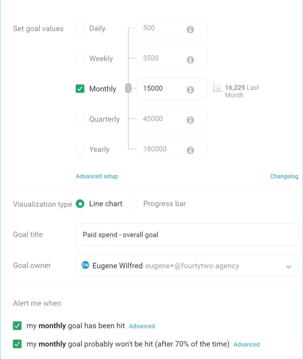
Then, we set up a goal for our new Paid Spend calculated metric. We can specify our short-term and long-term goals by selecting our goal values by day, week, month, quarter and year.
Lastly, we create an alert to trigger a notification when the goal has either been hit or not. Here is an example below:
Goals and alerts can be created for channel-wise spend, leads, opportunities, closed won, and more. We strongly recommend pairing goals with alerts in order to proactively monitor any significant activities.
We also focus on setting Goals for each individual client account. With this, we can use the Databox Mobile App to quickly check how each client is trending against their business objectives.
How do we use goals and alerts for optimization?
Combining goals with alerts helps us understand if we are trending in the right direction or underperforming. As an example, if we receive an alert to say our goal will not be hit, this will indicate we need to increase our spending by either creating new campaigns or allocating more budget to the top performing channels. Whereas if we hit our goal too quickly, we would reduce spending to ensure we stay on track.
Databox’s Support Team is Amazingly Helpful
As we’ve shown above, the Databox product helps us do our job much better. But, so does the team at Databox. They are available on chat all day and usually respond within minutes.
They are very knowledgeable about Databox as well as the tools they integrate with. And they go out of their way to help you. Which support team do you know that follows up after a week of closing your ticket, asking for anything new they can help you with? Dragana from Databox has done that several times for us. She and others on the team have done a fantastic job of helping us better use the platform, so that we can best help our clients better understand the ROI of every dollar they invest.
Closing Thoughts
Databox changes the way we speak about your performance by quickly helping us determine what can be improved. Here are some scenarios we have stumbled across with specific clients:
CEO of a client account - I don't think paid ads are yielding the results they ideally should
Before looking at Databox dashboards: The sales team is not converting the leads we’re generating.
After: If you look at the dashboard here, we are generating high quality leads at a good cost per lead (CPL). They are even moving to opportunities but are getting closed lost. We need to evaluate closed-lost reasons to see why this is happening..
CMO - Why is our cost per lead spiking this month?
Before Databox: I want to turn off the video campaigns that are not performing well.
After: If you look at the CPL trend report, The CPL spike is coming from a particular channel - paid social in particular. And if you look at the paid social dashboard, the video ad campaign is the one contributing to this spike. So we should just turn that video campaign off..
___
Regardless of the tool you use to measure how effective your paid media programs are, it is essential to clarify what is working and what needs to be updated. We hope that the information we shared above about how we use Databox was helpful and gave you more context on what needs to be measured and ways to do so.
What matters, in the end, is to understand the objective you are trying to accomplish and how everything is orchestrated to reach that goal. Falling into the trap of creating a predictable pipeline that does not convert is much more common than you would think. Ultimately, your goal as a marketer is not to show dashboards with positive data but to move the needle in terms of revenue.
____
What did you think of this piece?


